IELTS essay question
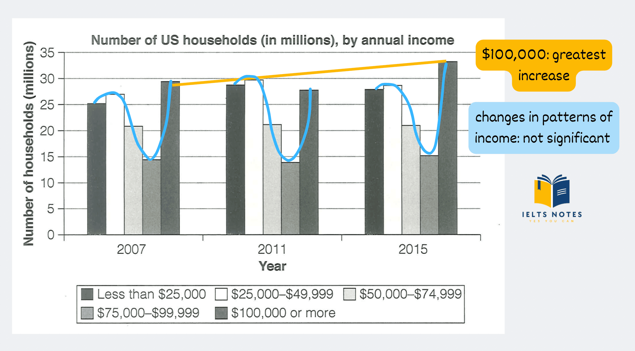
The chart below shows the number of households in the US by their annual income in 2007, 2011, and 2015.

Introduction
Rewrite the question using your own words.
The chart below shows the number of households in the US by their annual income in 2007, 2011, and 2015.
-> The bar chart gives information about the income distribution of US households in three years: 2007, 2011 and 2015.
Related posts
Overview
It is very difficult to get a 7 or above without a good overview. Let’s take a closer look at the task achievement band descriptors to see how important a clear overview is in IELTS Academic Writing Task 1.

- You can start your overview with: Overall, …
- Write the main trend(s) or overall picture of what you see in the chart(s).

Overall, the changes in the patterns of income over this period were not significant. The most striking change was recorded for households earning $100,000 or more annually, with figures experiencing the greatest growth.
Body
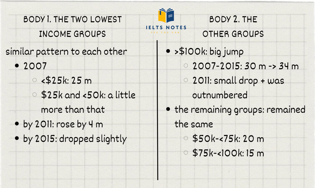
Plan your answer

Body paragraphs
Households in the two lowest income ranges had a similar pattern to each other. In 2007, there were about 25 million households that earned less than $25,000 per year, and a little more than that earned between $25,000 and $49,999. These figures rose by around 4 million by 2011 before dropping slightly by 2015.
The number of households with an annual income of $100,000 or more witnessed a big jump, rising from less than 30 million households in 2007 to roughly 34 million in 2015, despite a small drop in 2011 when it was outnumbered by the two lowest income groups. The numbers of households earning from $50,000 to $74,999 and from $75,000 to $99,999 remained almost the same over the period given, at a little above 20 million and approximately 15 million, respectively.
Sample answer
The bar chart gives information about the income distribution of US households in three years: 2007, 2011 and 2015. Overall, the changes in the patterns of income over this period were not significant. The most striking change was recorded for households earning $100,000 or more annually, with figures experiencing the greatest growth.
Households in the two lowest income ranges had a similar pattern to each other. In 2007, there were about 25 million households that earned less than $25,000 per year, and a little more than that earned between $25,000 and $49,999. These figures rose by around 4 million by 2011 before dropping slightly by 2015.
The number of households with an annual income of $100,000 or more witnessed a big jump, rising from less than 30 million households in 2007 to roughly 34 million in 2015, despite a small drop in 2011 when it was outnumbered by the two lowest income groups. The numbers of households earning from $50,000 to $74,999 and from $75,000 to $99,999 remained almost the same over the period given, at a little above 20 million and approximately 15 million, respectively.
Useful vocabulary
- income distribution = how the nation’s total income is distributed amongst its population
- pattern /ˈpætərn/ (n) = the regular way in which something happens or is done
- striking /ˈstraɪkɪŋ/ (adj) = interesting and unusual enough to attract attention
- witness /ˈwɪtnəs/ (v) = to see something happen
- outnumber /ˌaʊtˈnʌmbər/ (v) = to be greater in number than somebody/something
